
With all the new NBA uniform and alternate changes this year, I couldn’t help but check some of them out – really check them out. I know most people say “change is a good thing” but let’s just say, that phrase doesn’t necessarily apply here. Here are some that I loved, and others that I wish would just stop!
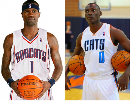
1. The Charlotte Bobcats: MAKE IT STOP!
Well, never thought there’d be another reason to thank God I don’t live in Charlotte, but here it is!
via news.sportslogos.net
Okay, maybe they do look a little cleaner than last year’s home uniforms (left), but nothing more screams “soft” than the word CATS on an NBA jersey. You can’t tell me the new home jersey (right) doesn’t look like it came right out of High School Musical 2. I get that ex-owner Bob Johnson’s gone, still no need to take out the “Bob” in Bobcats.
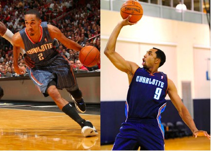
Via news.sportslogos.net
The Bobcats’ away jersey’s also look cleaner than last year’s. So why do I still wish they would stop? Because it’s so not original! Utah, Memphis, and Dallas all have double-blue color schemes already. Seriously, make it stop.
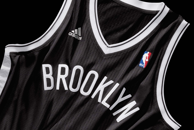
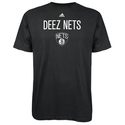
2. The Brooklyn Nets: GOTTA LOVE IT!
via helmetgame.com
Goodbye Red, White, and Blue. Hello Black and White. Words that come to mind when I look at these: Classic. Simple. Fresh. Clean. I also like the herringbone pattern along the flank (Although I secretly wish there was a woman’s version with hounds tooth along the flank, but that’s just me). Thank you Jay-Z. We all know Jay-Z is the minority owner of the Nets but his influence on the team is easily seen here. Word around Brooklyn is they sell shirts at Barclays that read “Deez Nets.” You Gotta love it!
3. The Denver Nuggets: MAKE IT STOP!
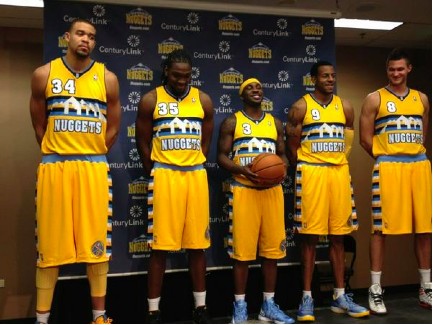
The Nuggets have gold jerseys now? What a concept! These Jersey’s have gotten mixed reviews, and it’s easy to see why. Technically, these “new” alternates aren’t really new though, but a new spin on the old classic.
Remember these? (Insert laugh here)
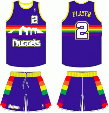
I’d say the new ones are ten times better than the ol’ Denver Skittles. Plus they don’t look like a screenshot of an old Sega Genesis video game. I can do without the striped side on the shorts however; it’s a bit much. The only cool thing about these uniforms is the skyline.
(Now if only Miami or LA would make an alternate skyline jersey…now we’re talking!)
4. The New York Knickerbockers: GOTTA LOVE IT!

DAVID DOW/NBAE/GETTY IMAGES
We all know that Dwight Howard is the NBA’s superman (That’s right Shaq, get over it) but these new Knicks uniforms make Tyson Chandler and Amare’ Stoudemire look like superheros! I love the comeback of the colored waistband and I like that it’s now a solid royal blue (the away jersey’s have orange ones). I also love the switch back to scoop necks for New York. Just seems right. I also like the fact that they took out the color black, especially since New York’s other team is sporting that color.
One detail you can’t see from the above picture is what’s inside the collar of the new uniforms: “Once a Knick, Always a Knick.” Try telling that to Jeremy Lin…(Awkward).
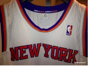
Side note: If you look closely you can see the stripes around the arms don’t go all the way around anymore. The change was made for aesthetics and comfort. Smart move? Maybe. Fashion Friendly? Ehh…not so much. Still, you gotta love this one.
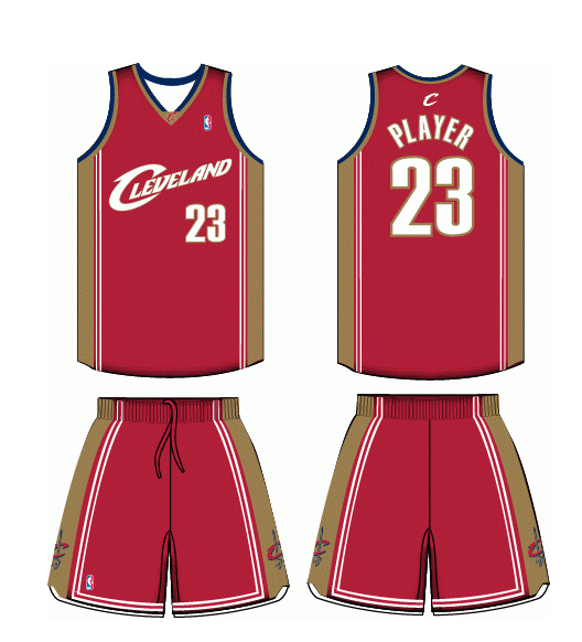
5. The Cleveland Cavaliers: GOTTA LOVE IT!
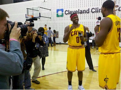
It’s about time Cleveland got a new look. Even if it’s just an alternate. (The change should of came 2 years ago when Bron Bron left.) I know you’re thinking “Not another gold uniform.” But to be completely honest, I’m not in love with the color scheme either; you just gotta love the fact that they finally got a new look – No matter what it is!
Dear Cleveland fans,
We all know you’re pro’s at burning jerseys, so do us all a favor and throw all of them in the pit: